A large payments technology company approached Mutual Mobile about working together to create an updated and easy to use point of sale (POS) system for restaurants. Many POS systems being used in restaurants today were designed decades ago and have simply been added to over the years, with little consideration for how restaurant employees are actually utilizing them. Several companies have attempted to make more user friendly POS systems for restaurants in recent years, but each had its problems, and both we and our client knew we could do better.
Our client came to us with a lot of ideas, and felt that they knew exactly what the restaurant employees needed. While the knowledge that they had gained over years of working in sales of restaurant POS systems was valuable, we knew that we needed to see these systems in action and talk to the people using them in order to truly understand what was working and what wasn’t. We kicked off a six week Discovery phase in order to better understand the users, the design needs, the technology behind the system we were using, and the goals of our client.
User Research
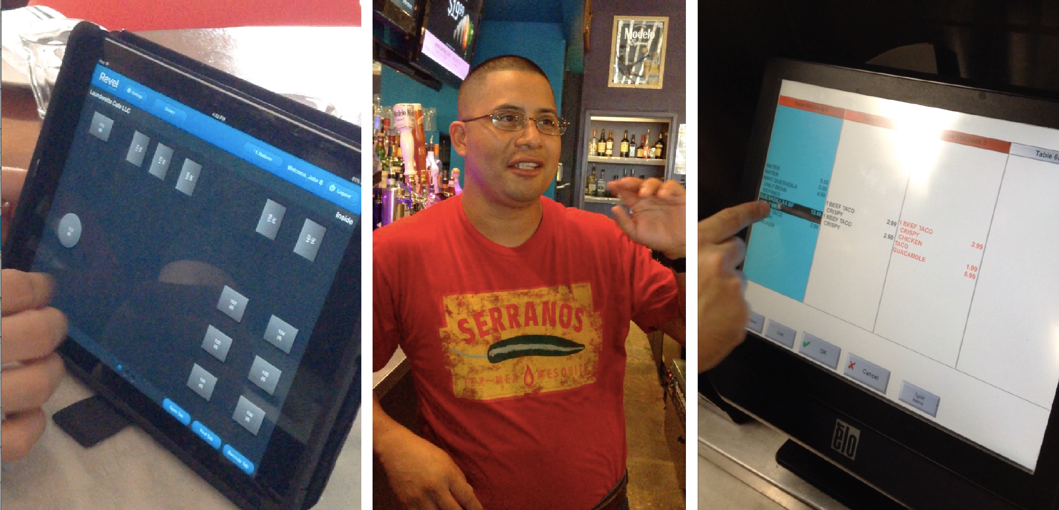
We began our Discovery with two weeks of user research in order to identify problem areas with current POS systems, evaluate the larger role the POS plays in the restaurant, and evaluate the impact restaurant type has on the way the POS is used. I collaborated with two user researchers and another designer to visit 7 different restaurants and interview and observe 20 restaurant employees ranging from servers to managers to owners. We repeatedly found that users were frustrated with the POS system they were using, and had created a number of workarounds to get the system to do basic daily tasks. Speed is also a high priority in the restaurant business, but with the current design and lack of support for regular tasks, this often leads to error, which is often not handled elegantly by the system. In many cases, serious errors would not be discovered until it was time to print the ticket and receive payment, leading to irritated and dissatisfied customers.
After completing our research, the four of us worked together to distill nine key insights from the vast data we had obtained. We were then able to provide key data points around these insights and disseminate our findings to the rest of the team and the client. These provided a deep and shared understanding of how POS systems were currently being used, what they meant to users, and what the biggest pain points were for the people using them every day.
Design Principles
The insights from our research then helped to guide the creation of six driving principles that would be used to guide our design throughout Discovery and beyond. By constantly reminding ourselves of these principles, and coming back to them throughout the process, we could ensure that we were designing a system that is in the best interest of the restaurant employees using the POS. Our six core principles were:
– Context Driven Design
– Eliminate Excess
– Manage Density
– Forgiveness
– Flexibility
– Optimization for Intermediates
Experience Workshop
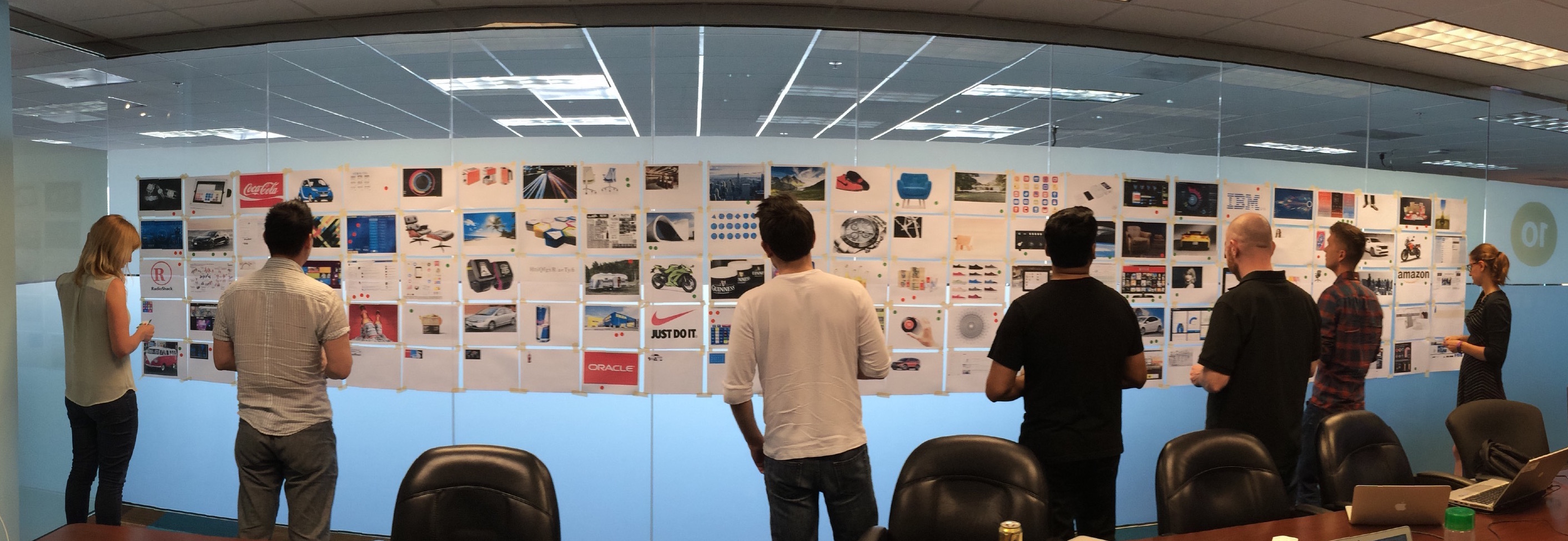
During this phase, another designer and I led an Experience Workshop with our internal team and clients. Using a huge variety of pictures posted on the wall, we had each person mark images that they felt represented this product brand, and those that they felt didn’t. We then had a discussion about each opinion. This allowed us create a unified understanding and vision for the product in terms of values, user experience, and visual design.
Design
Using my new knowledge of how restaurant employees interact with their POS systems and our guiding principles I began mapping out our design. I started with an app map to get an overall picture of all the needed features, and how the user could move between them. At this point I began working closely with our developer in order to understand the technical restraints of the platform and ensure that my flows and designs were feasible.
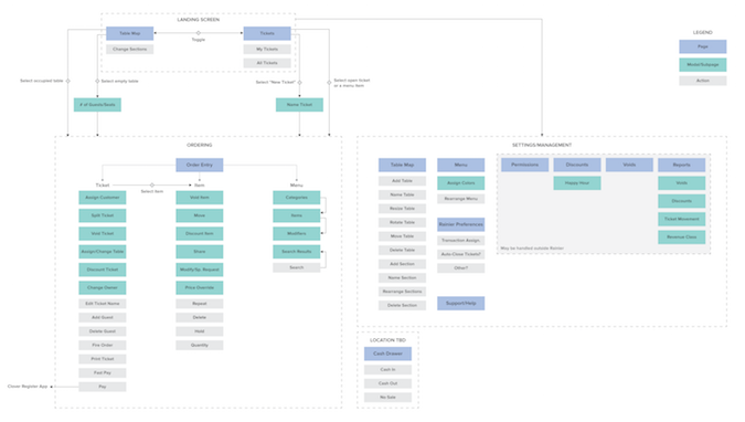
Once we had the flow and a strong shared product vision, I began sketching potential designs for the individual screens within the POS system. Based on our research, I knew that the key interactions users had with the POS were creating and editing tickets, and modifying the table map. Continuing to collaborate with our developer and review with our client, I iterated through numerous possible versions of each of these screens, sketching out key flows that a user may need to complete. Eventually, I created two interactive prototypes using Axure. These initial wireframes and prototypes would set the stage for moving into the Delivery phase.
Wrap Up
At the end of our six week Discovery, we presented a detailed report of all our findings and recommendations to our client (including those from the technical discovery that coincided with research and design). The client was very pleased with the work we had done, and for the first time got to see how solid user research could inform a more useable design. Due to our extensive work on research, design and technical discovery, we are now set up for a well-informed Delivery phase for this client.