Overview
Signature Homes builds communities in the southeastern US and works closely with homebuyers to personalize all the selections in their home. Outstanding customer experience is central to their business model, but they were struggling with long soft cycle times, laborious processes, and homebuyers who were overwhelmed by the decisions required. They wanted to introduce a digital portal that would help streamline their process for both their employees and their customers.
We worked with them for over a period of 10 weeks to conduct generative research, design a new digital platform, and perform user testing on the designs. Several months later, we also worked with them to develop the new platform.
Generative Research
After an initial design workshop with the client, we conducted research interviews with seven homebuyers and eight Signature Homes employees in order to gain a deeper understanding of the home building journey, as well as uncover any pain points and delights that occur throughout the process. We used this research to home in on the focus area for the MVP of the product.
We found four themes in our research: Design Decisions, Communication, Processes, and Customer Experience. We presented both the positive and negative findings for those themes to the client, broken out by feedback from the customers and the employees.
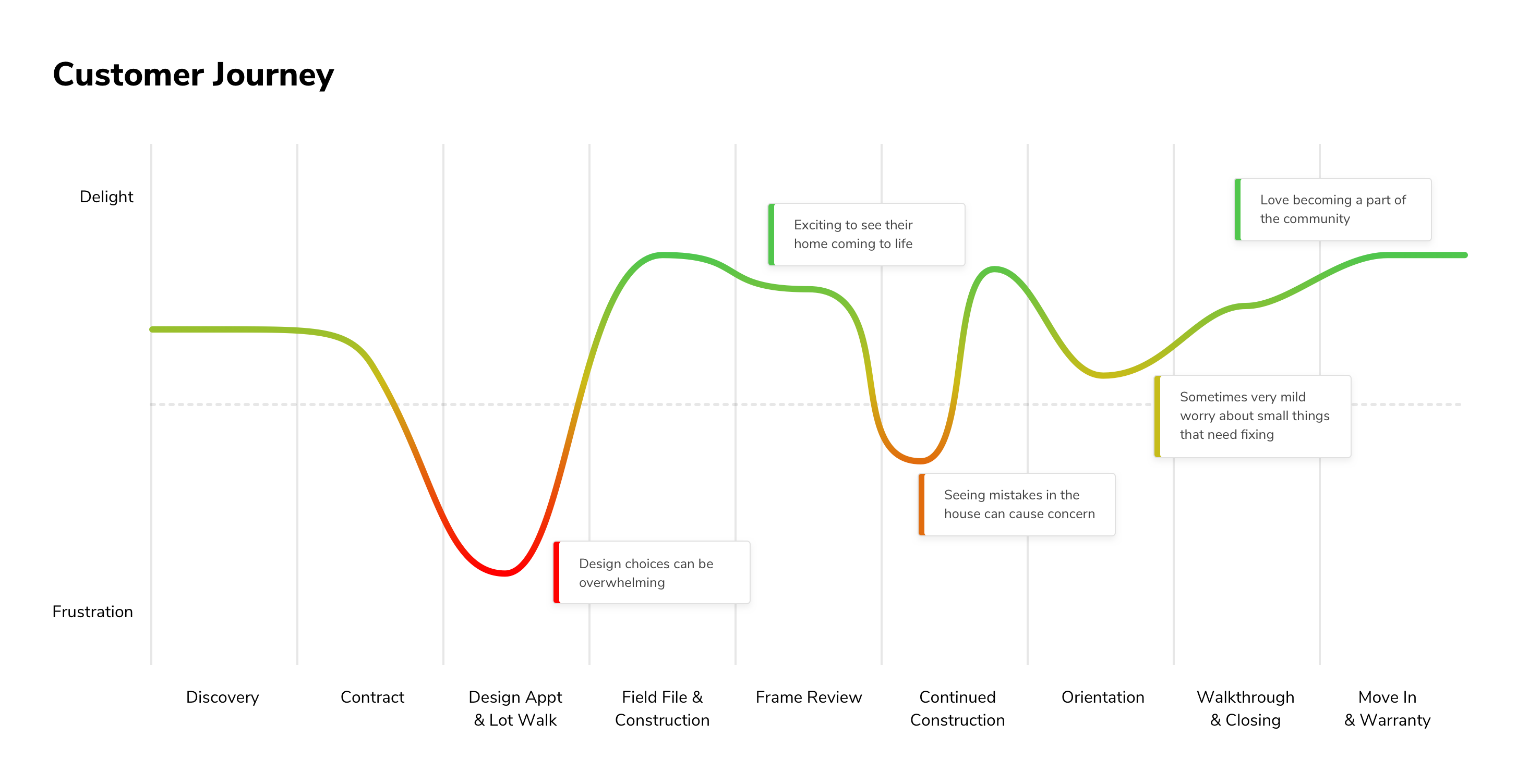
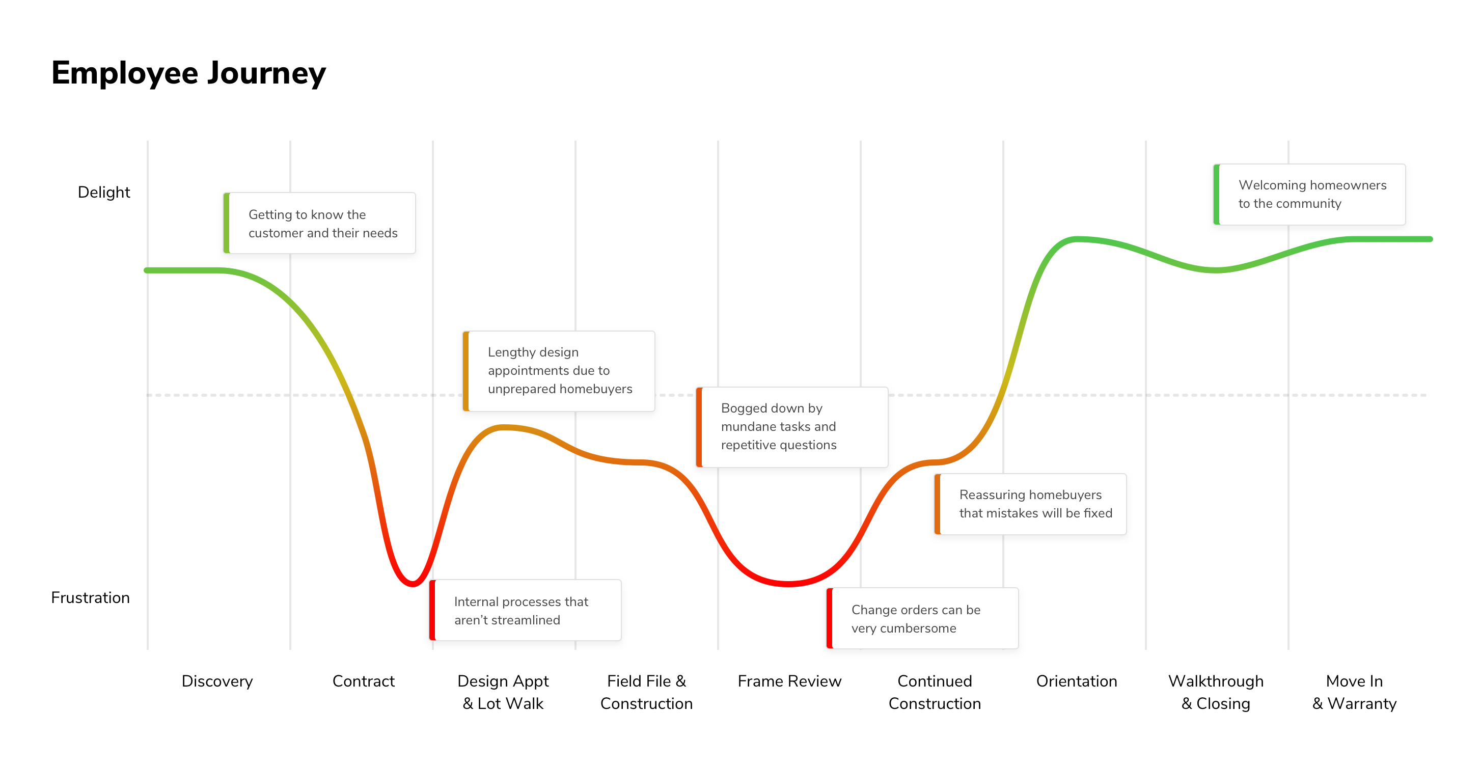
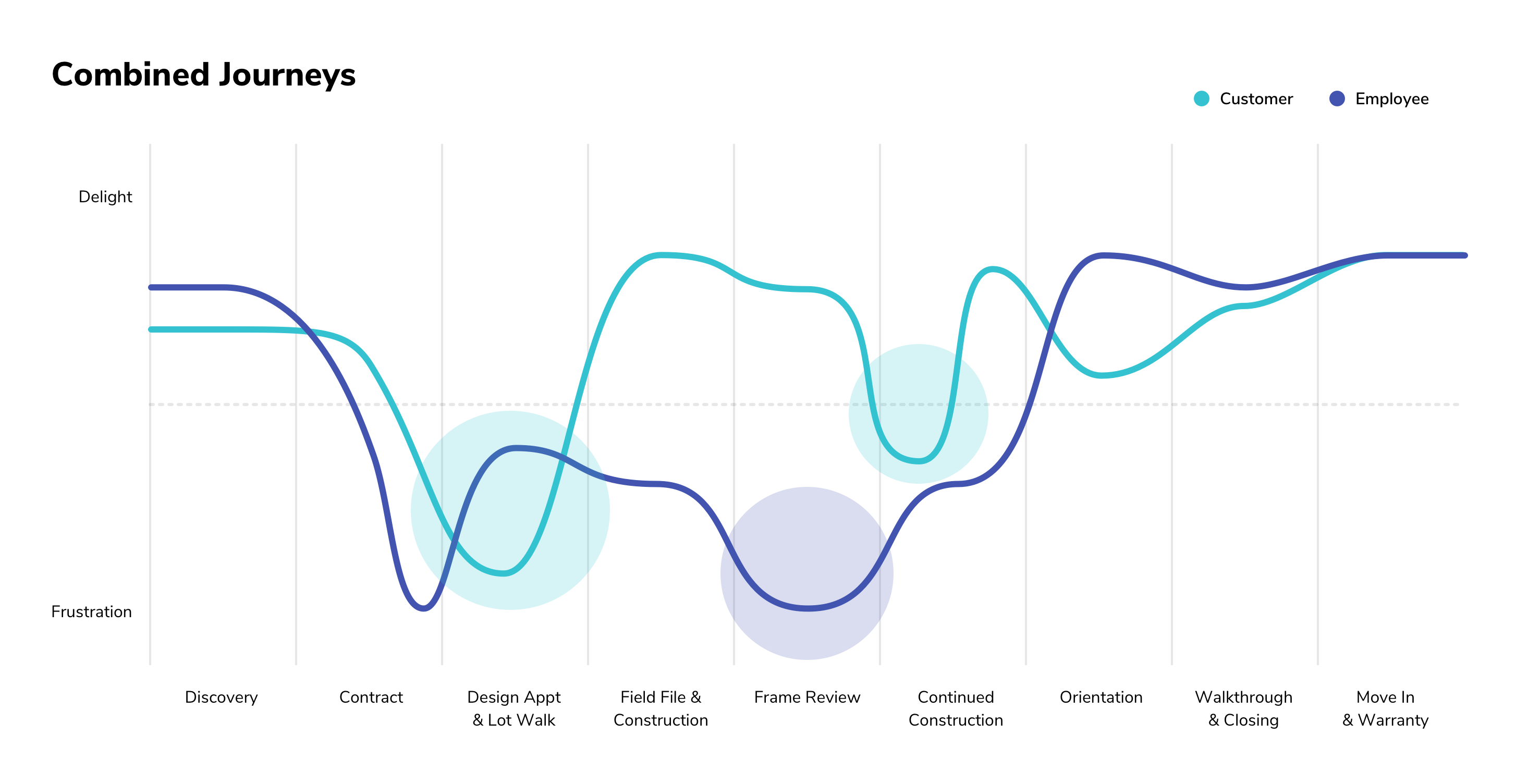
Based on our findings, we also created journey maps for the homebuyers and the employees, and then overlaid those maps in order to highlight where the lowest points of the journey were. Using our data and the journey maps, we were able to make the decision with Signature Homes to focus on improving the process of the design appointment, which is when homebuyers must make all the selections for the finishes in their home. They receive a large printed catalog outlining all the options, and many homebuyers expressed that they were overwhelmed by the choices. The interior designers at Signature Homes also had to spend a great deal of time preparing for the meeting, answering questions, and then inputting selections into the system afterwards.
Design
We began by brainstorming ideas of how we could reduce the pain points and support customers in making the decisions that are required for the design appointment. We also sketched a number of these ideas, and different navigation structures that we could use to structure Signature Homes’ vast catalog of options.
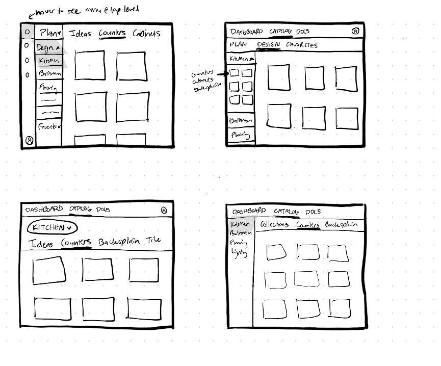
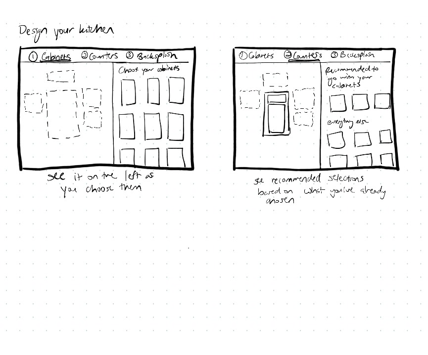
We then created wireframes of several different concepts and presented these to the client. After numerous rounds of iteration, as well as collaborating with a developer to understand the feasibility of different solutions for an MVP, we landed on a final concept which we fleshed out fully in wireframes for both desktop and mobile.
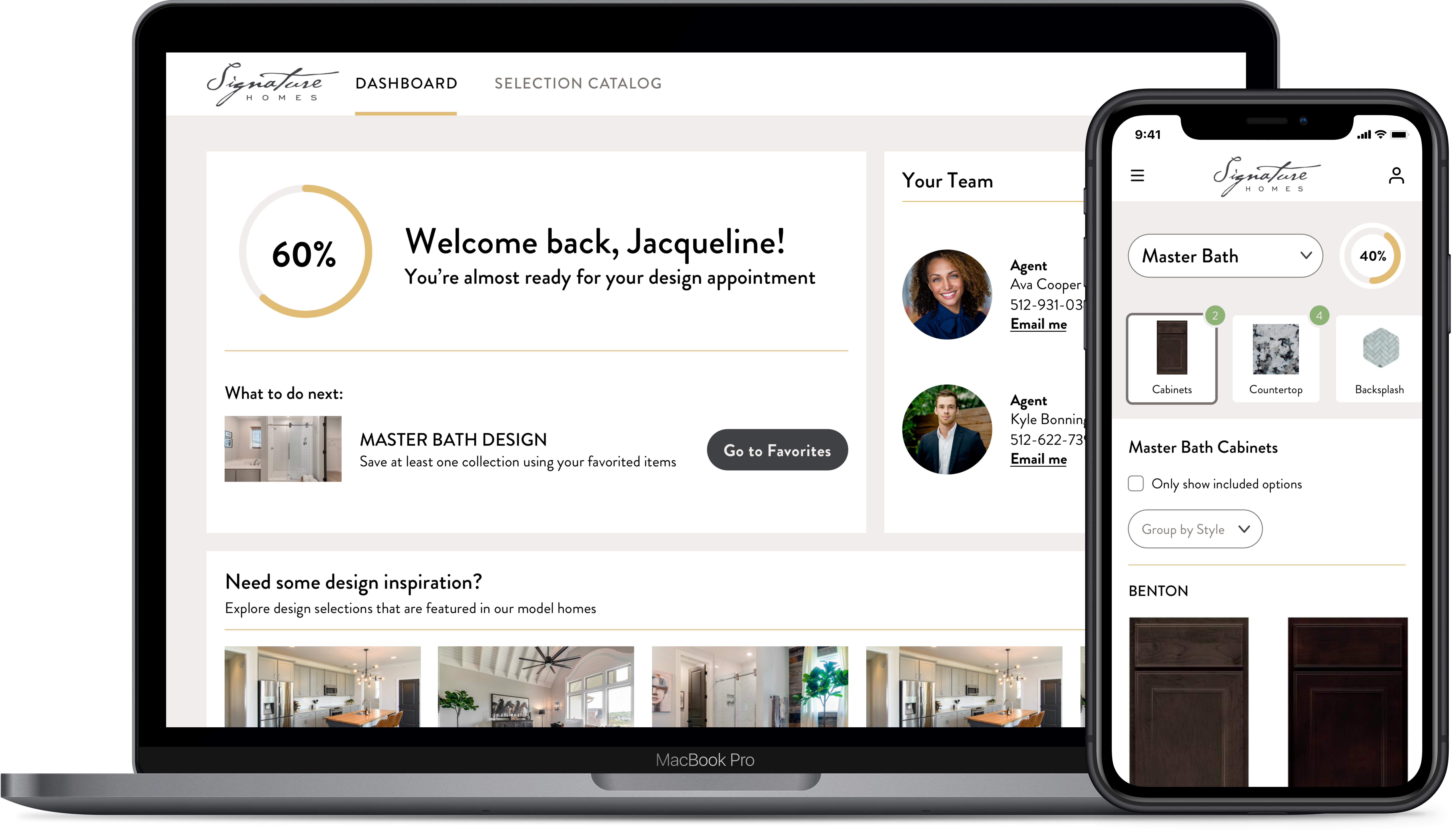
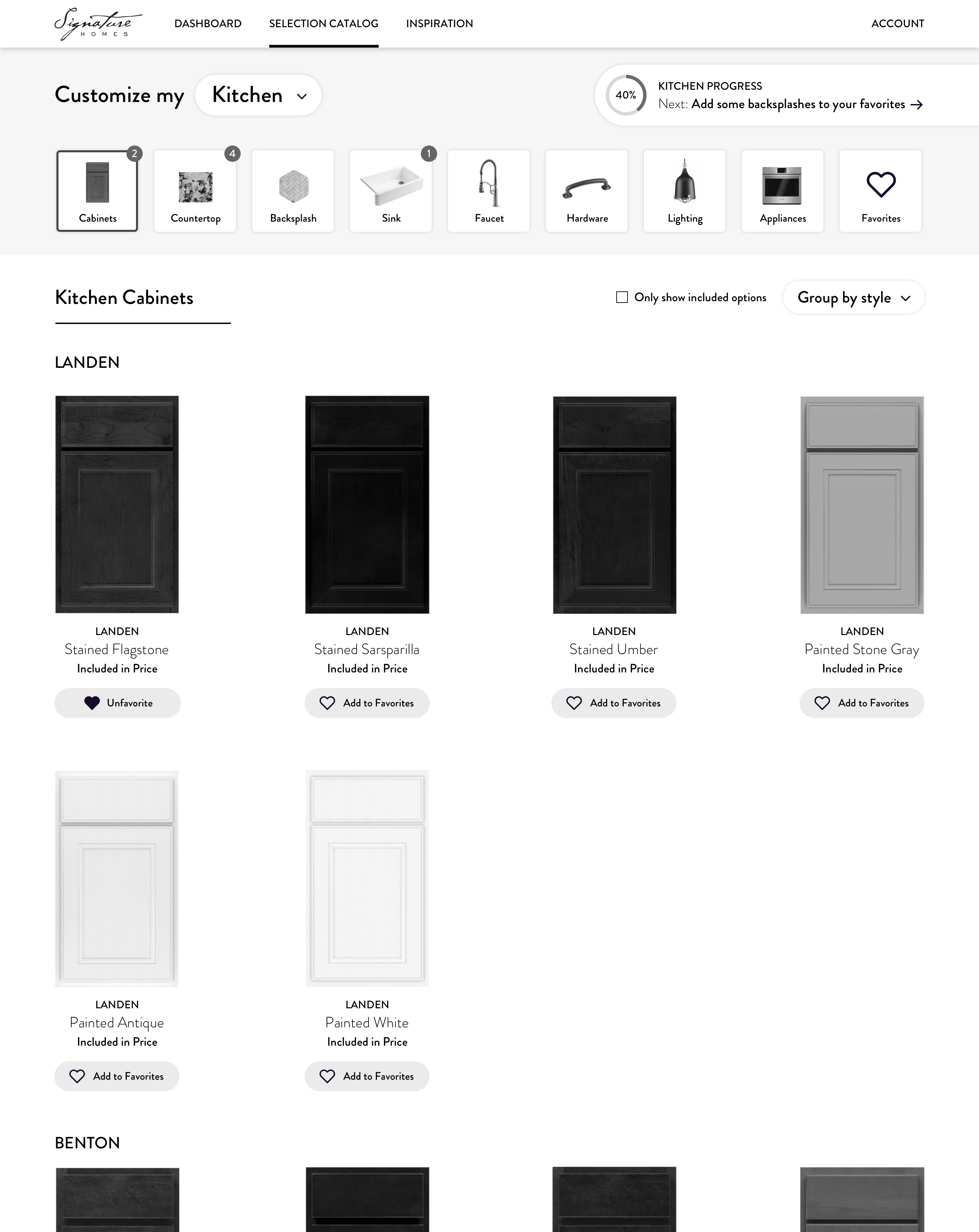
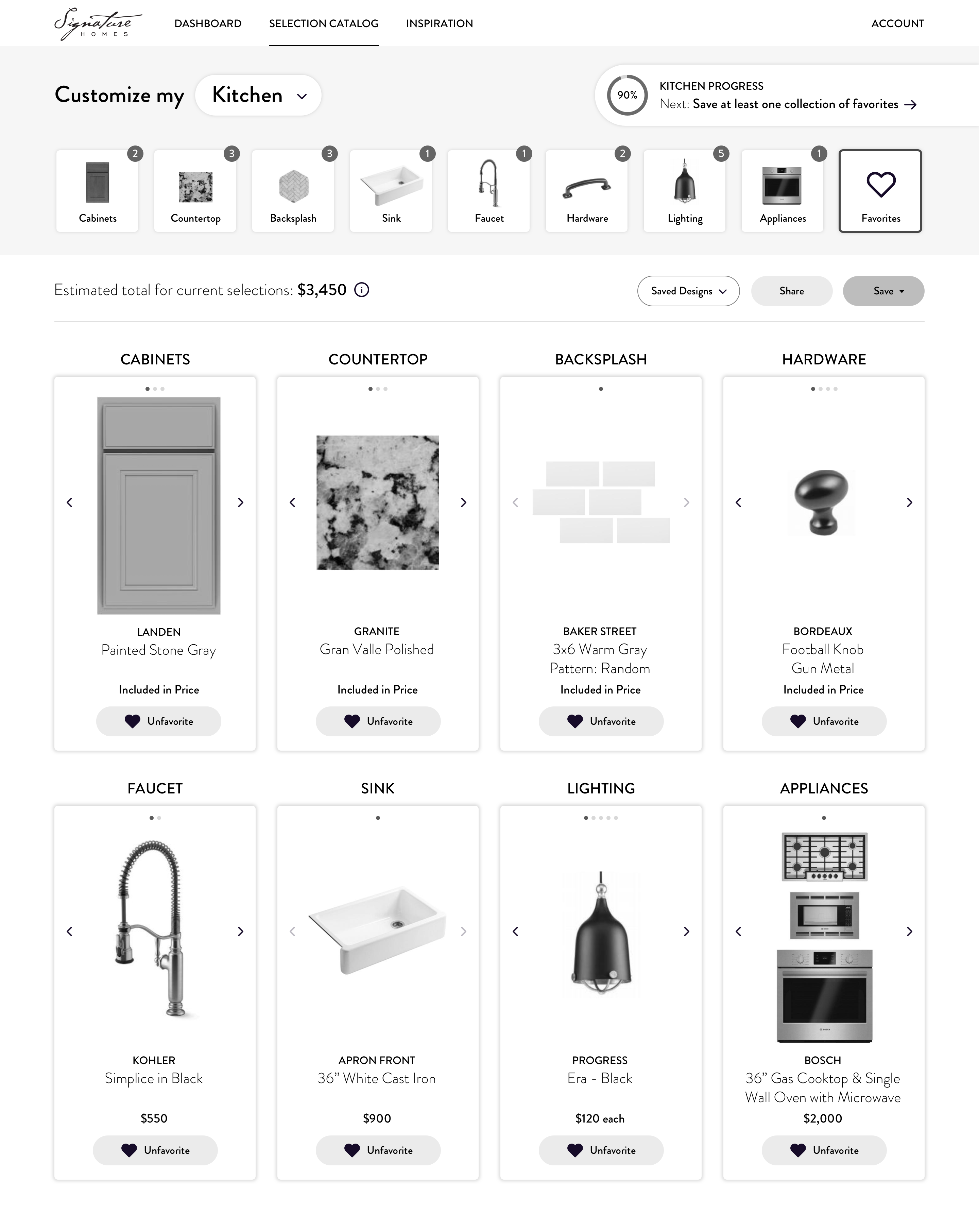
The ability to browse the catalog and save favorites allowed homebuyers to narrow down their choices ahead of the design appointment. They were able to see all their favorites together so that they could cycle through their selections for each category and see how they would go together.
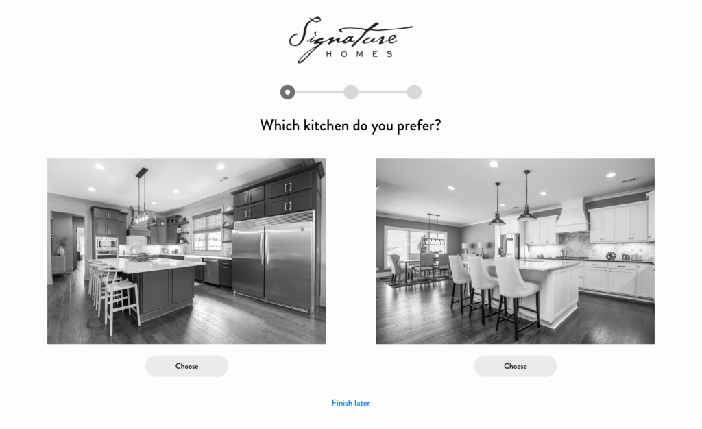
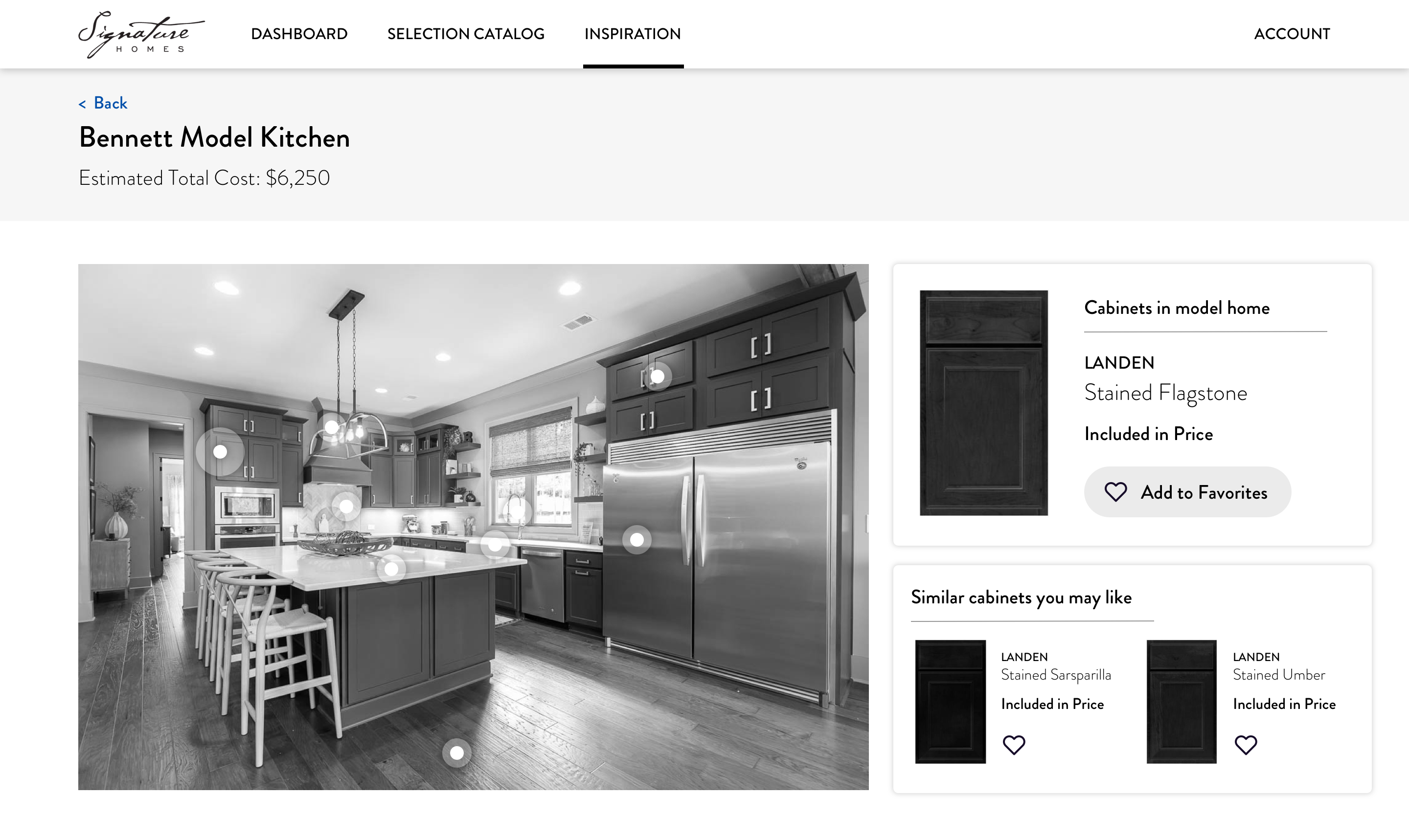
During research, we found that there were several common methods that homebuyers used to narrow down their choices. They would often consult with the interior designers to get their advice on selections that would align with their tastes and create a cohesive interior design. Many homebuyers would also visit the model homes and use them as inspiration for how different elements come together in a home. To emulate these experiences in the application, we created a style quiz that would provide product recommendations based on the homebuyer’s style preferences; we also added an Inspiration section where homebuyers could see photos of model homes and what options were in that photo.
User Testing
We created a clickable prototype of the wireframes in Invision and used this to test the primary flows with six different Signature Homes customers. Overall participants responded positively to the portal and felt that it would streamline the process of making their design selections.
We made a number of updates based on feedback from the participants. While most people enjoyed seeing selections in context during the style quiz, it was generally a stumbling block and tended to confuse homebuyers more than help them. We decided to remove it entirely in order to keep the focus on the catalog and get users to their main tasks more quickly. We also updated the content in various areas in order to improve clarity and streamline the process. For instance, we modified the dashboard so that it gave a single “next step” rather than several options of what to do next, because many participants felt overwhelmed when given multiple options.
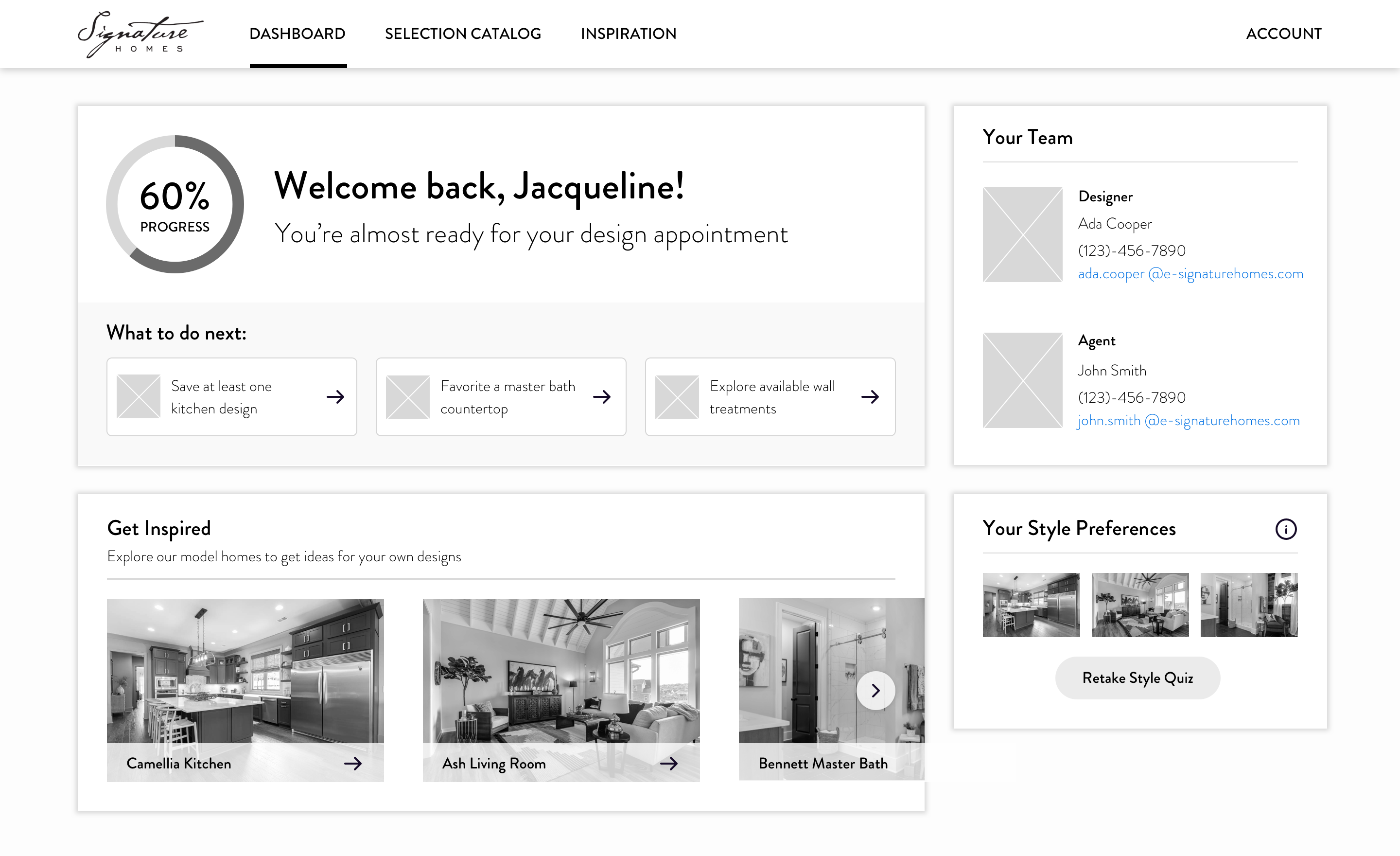
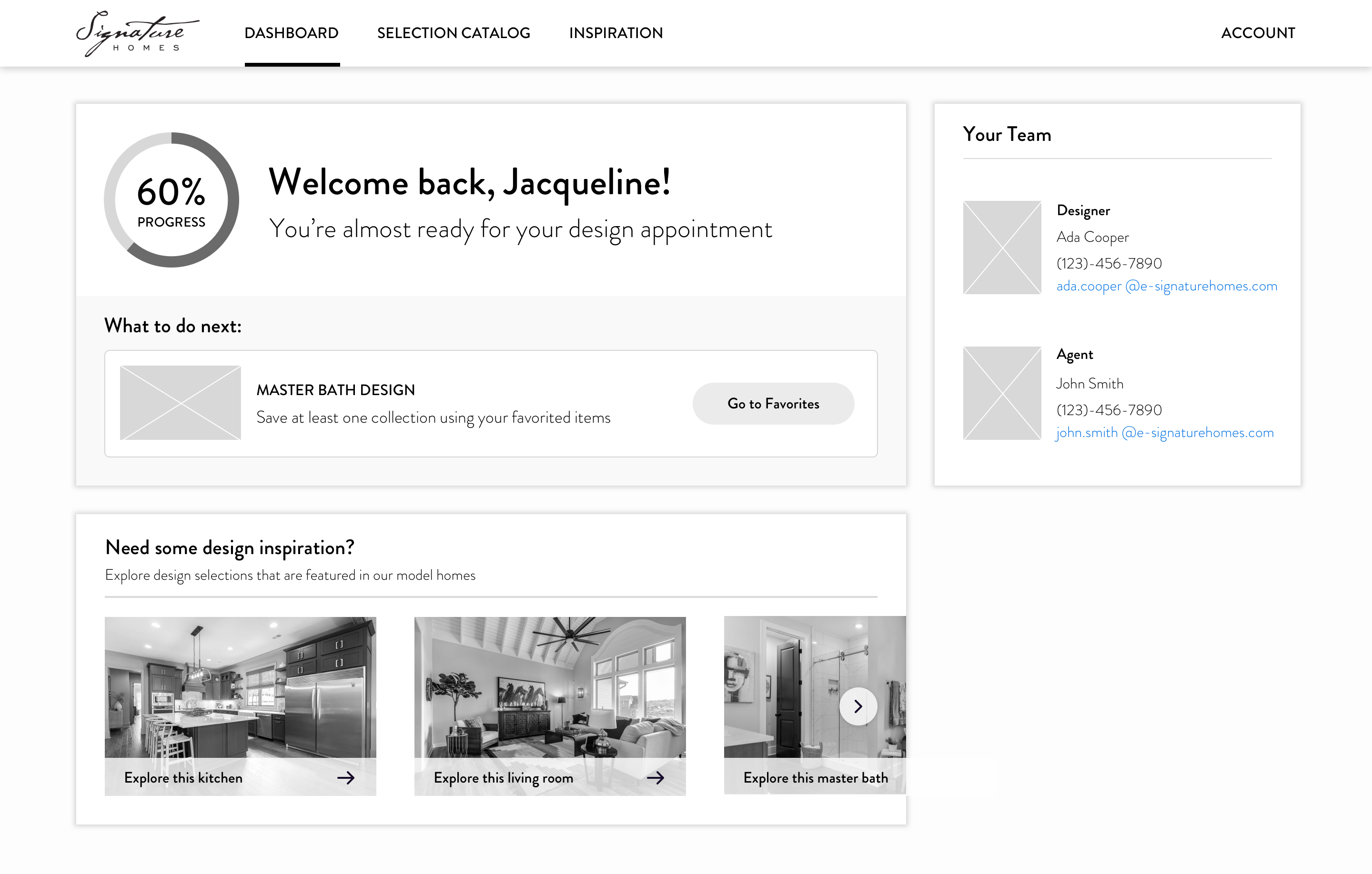
Dashboard before (left) and after (right) user testing
High Fidelity Designs & Development
Finally, we created a style guide based on Signature Homes’ existing branding and designed high fidelity versions of key screens. The team then used these high-fidelity designs to develop the customer portal, which was launched the following year.